UX/UI Case Study
Elon Ontrack Student Contact Information Wizard
THE PROBLEM:
Elon students are not keeping their contact information up to date.
Contact information for Elon students is usually requested during freshman orientation. However, there is not a current system that encourages students to keep their information up to date throughout their academic career. As a result, many students have incomplete, missing, or outdated contact information.
THE SOLUTION:
A New Student Contact Information Wizard
I designed an interactive pop-up wizard that will appear when students log into their OnTrack accounts. The wizard guides students through reviewing and updating their contact information, including their personal identifiers, phone numbers, email addresses, resident addresses, and emergency contact information.
FINAL WIREFRAMES:

Contact Information Wizard Stage 1: Personal Identity

Contact Information Wizard Stage 2: Contact Information
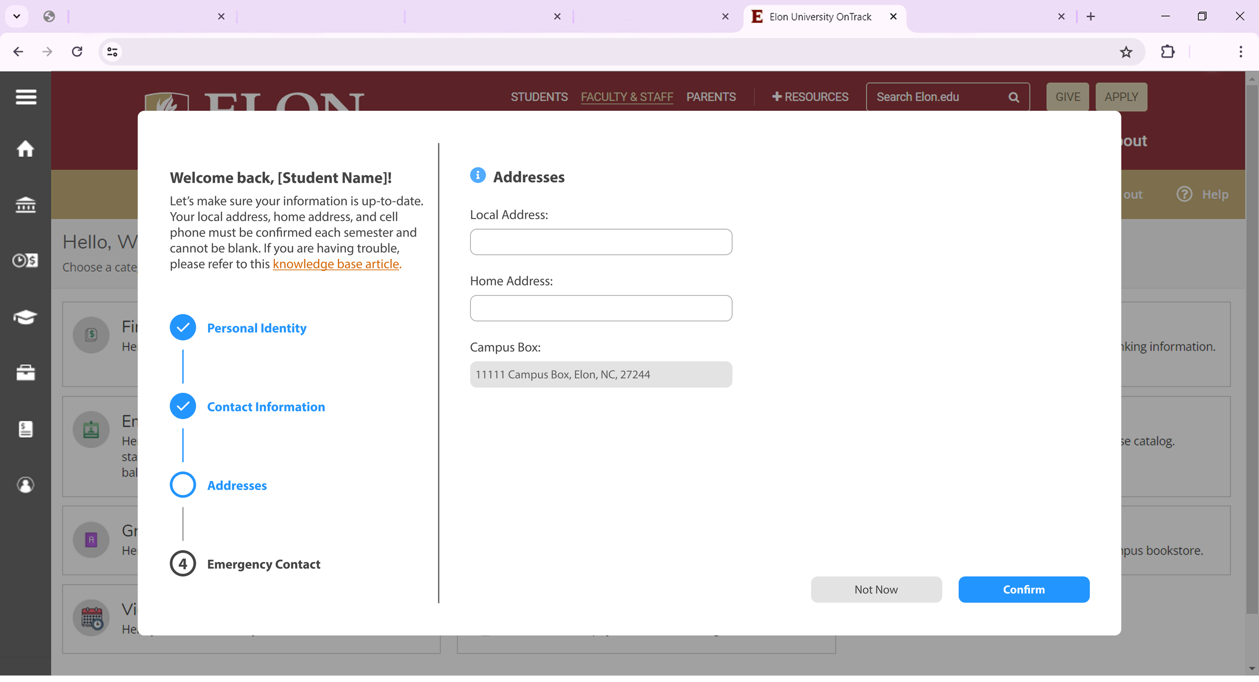
Contact Information Wizard Stage 3: Addresses
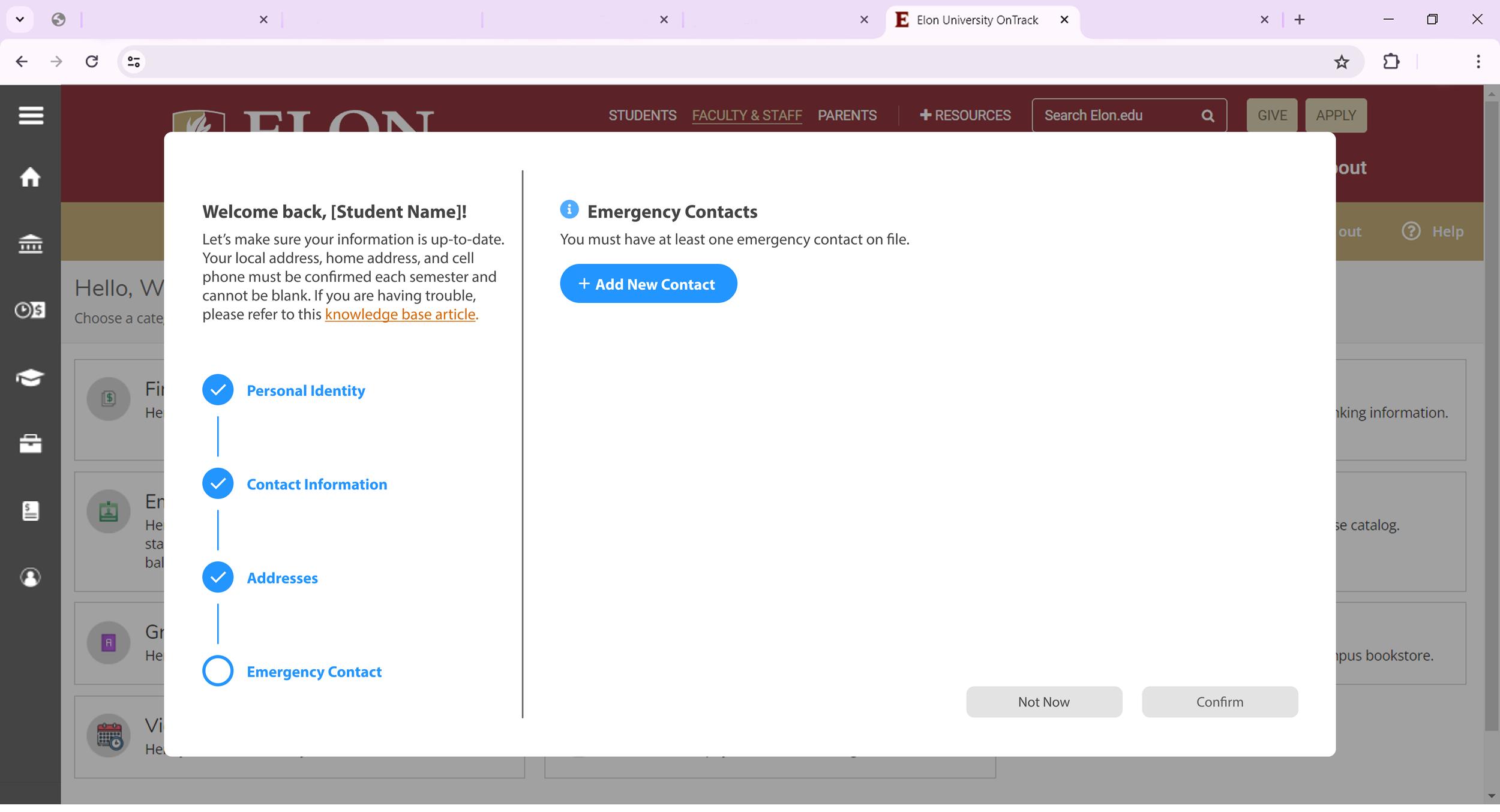
Contact Information Wizard Stage 4: Emergency Contacts (No Added Contacts)

Contact Information Wizard Stage 4: Emergency Contacts (Adding A Emergency Contact)
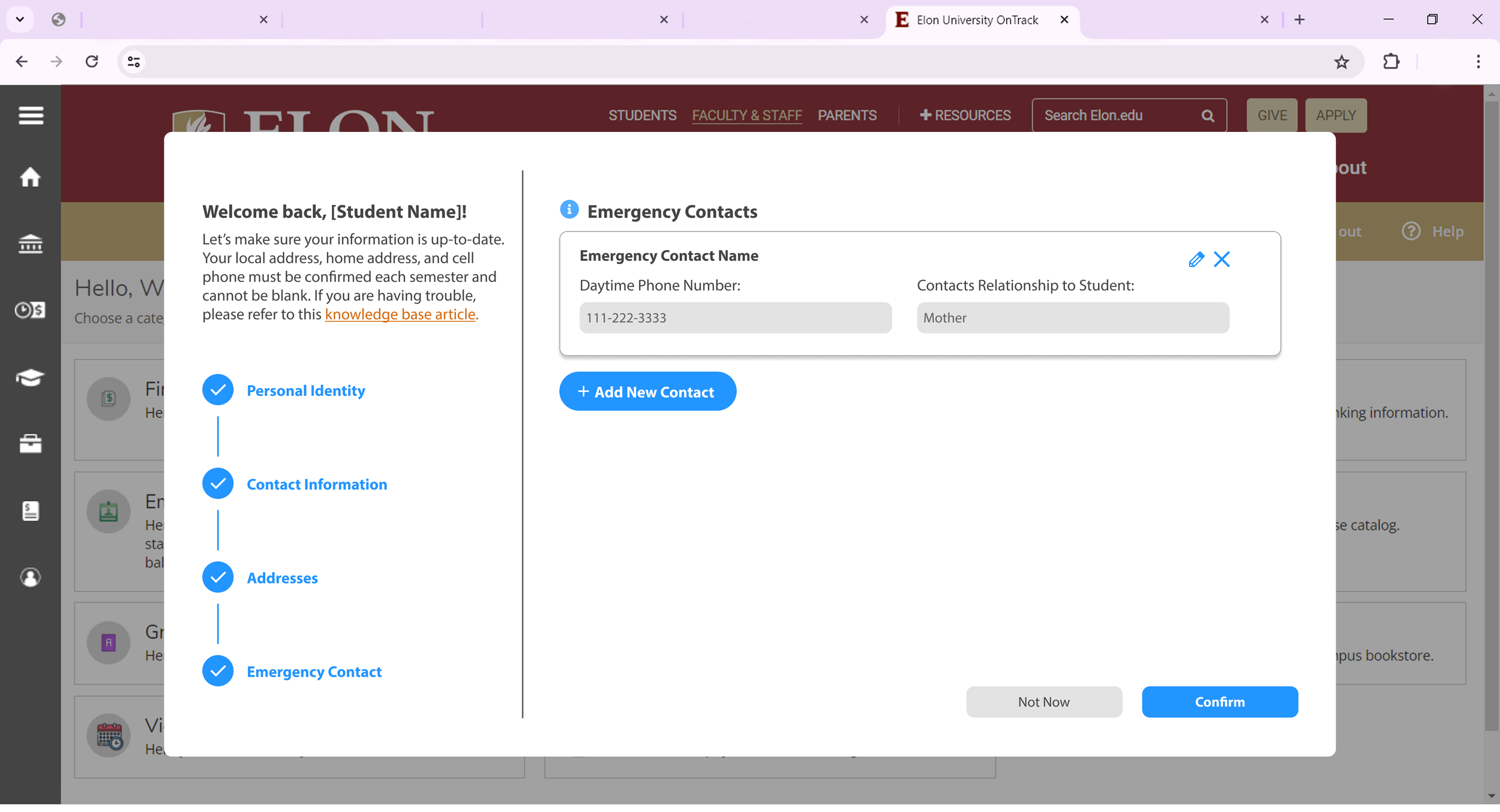
Contact Information Wizard Stage 4: Emergency Contacts (Review Current Emergency Contacts)
RESEARCH:
The Current Status of Elon Emergency Contacts
For the 2024-2025 academic year, Elon University has 7,289 enrolled students*.
Of those students, 1,449 have added their emergency contact information to their profile at some point throughout their academic career.
Of those students, only 198 have updated their emergency contact information since August 2024.
*According to Elon at a Glance Facts Report for 2024-2025
Split Between Two Screens
Currently, student contact information is split between two different screens in OnTrack, Elon’s student self-service portal. Information such as phone numbers, address, and personal identifiers is listed under ‘User Profile’ while emergency contact information is listed under ‘Emergency Information.
Current User Flow:
Ontrack Home Screen > Tree Menu > User Options > User Profile or Emergency Information
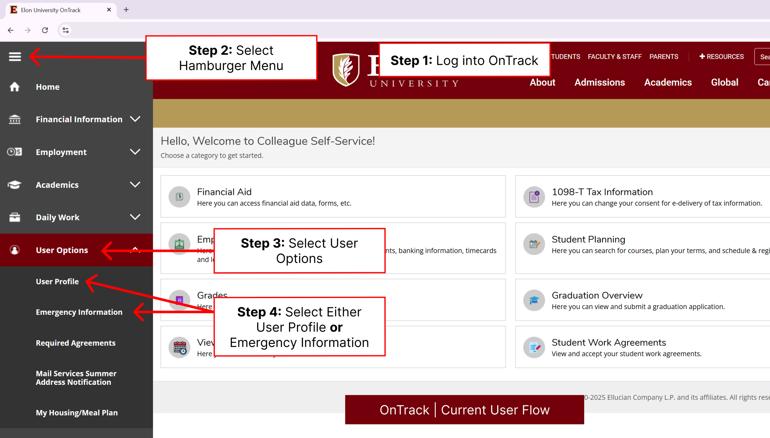
With students' contact information split between two screens, it makes it harder for students to find and update their information. Especially since there isn’t a current process telling students how to update their information.
INITIAL DESIGNS:
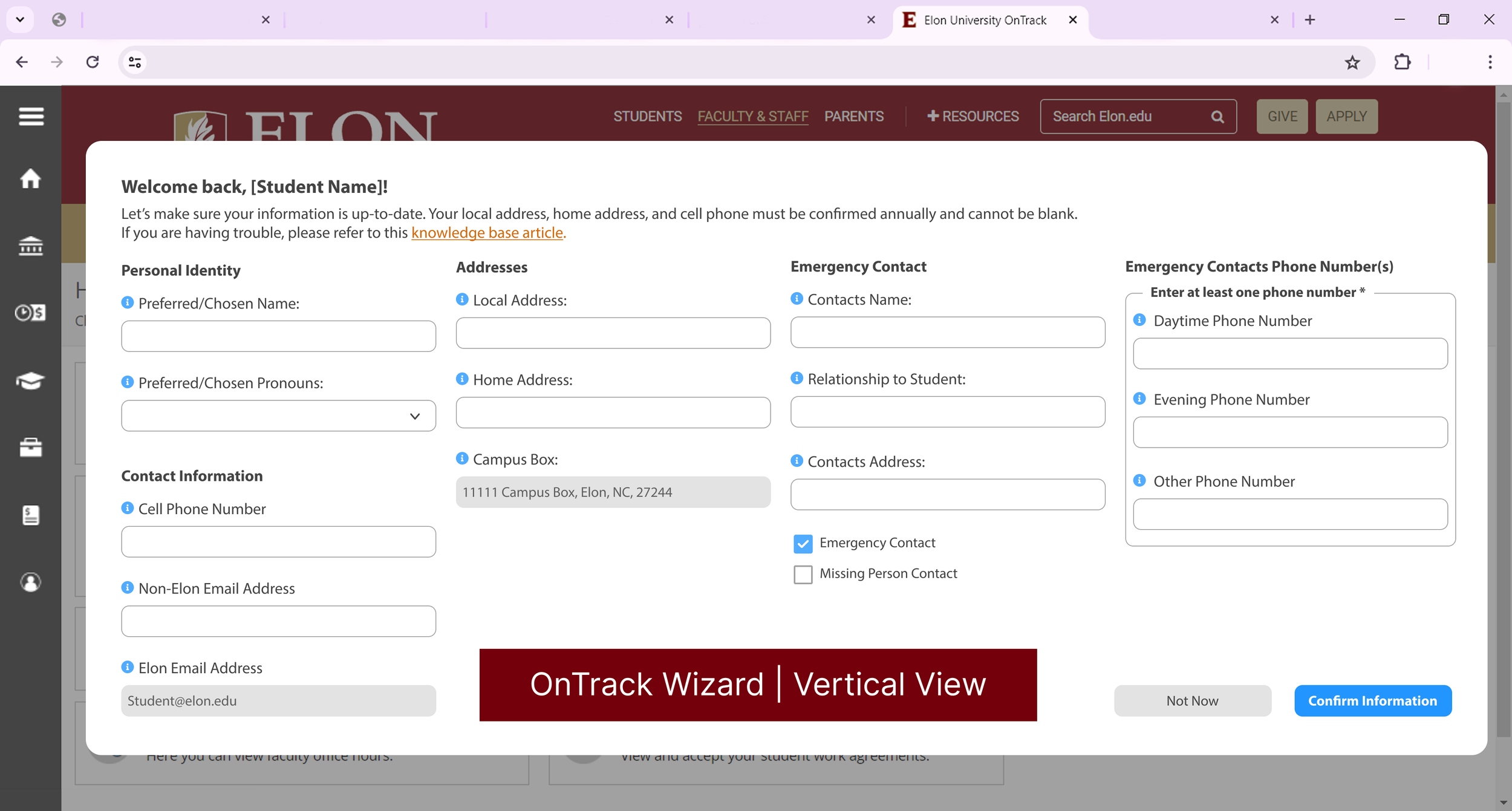
Testing Different Pop-Up Layouts
Throughout the redesign process, my team was interested in testing different layouts of the form to see how we wanted to implement the form into OnTrack. Knowing we had a lot of questions to display on the form, I mocked up two different layouts, vertical and horizontal, for the team to review.
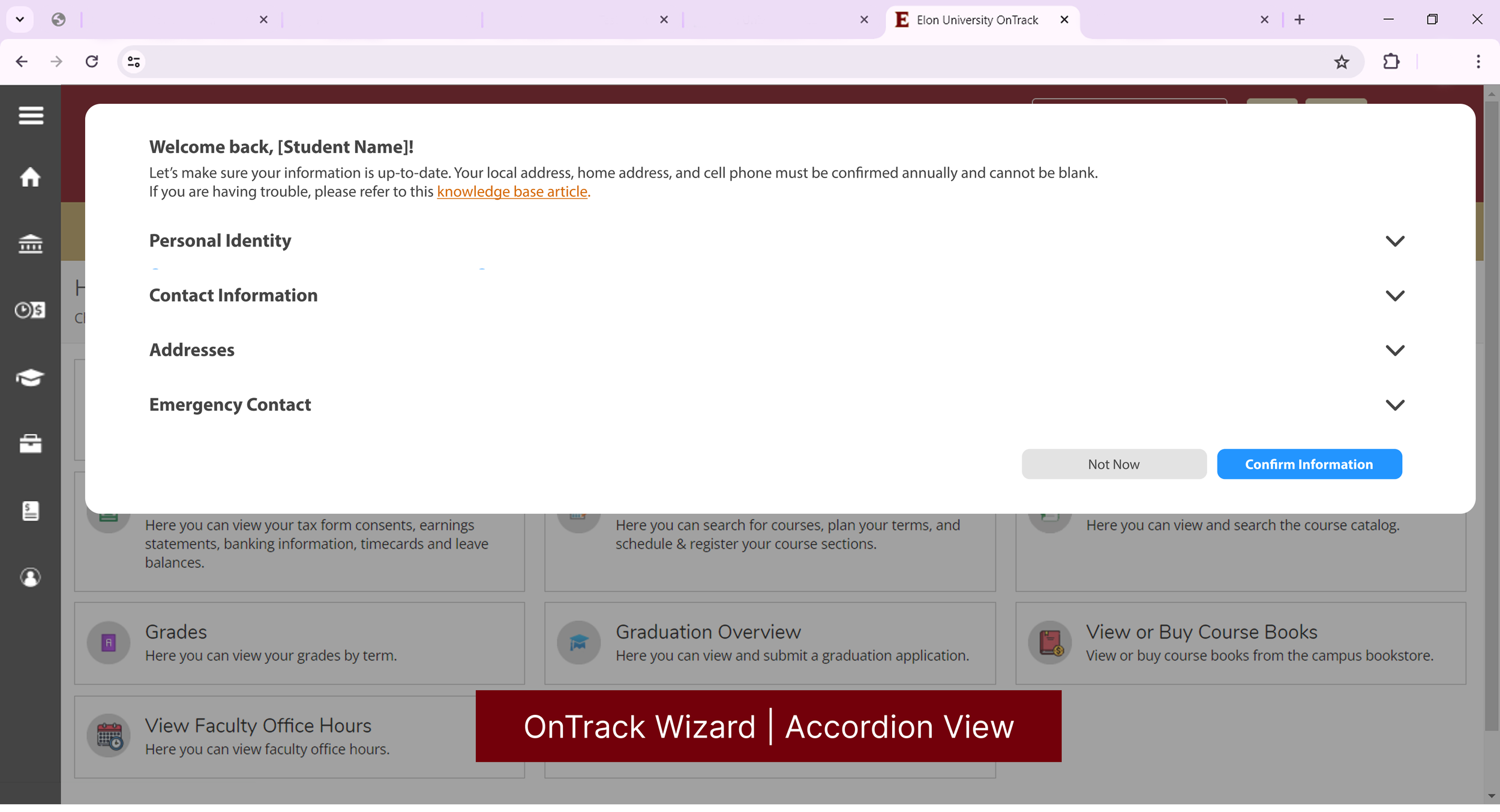
After seeing the amount of questions needed for the updated form and feeling overwhelmed by the number of questions presented, we decided to try an accordion layout that simplified the form into four sections. This design was approved and sent to the web development team.
FEEDBACK + IMPROVEMENTS
Crucial Feedback from Web Developers
The web development team had concerns that the accordion layout for the form wouldn’t meet WCAG standards for screen readers. After meeting with my team, we decided to transition the form from an accordion layout to a custom wizard UI.
FINAL DESIGN
A New Student Contact Information Wizard
Upgrades from Previous UI:
Restructured the existing contact information forms to ask for new information requested by the university.
Grouped questions into four categories and organized them using a new wizard UI.
The wizard guides students through reviewing and updating their contact information.
Added validation that automatically fills in existing permanent fields from a student's profile. For example, their on campus mailing address.
Every semester, students will have a grace period to verify their information. Once the grace period ends, the pop-up will reappear without the option to delay verification.
Contact Information Wizard Stage 1: Personal Identity
Contact Information Wizard Stage 2: Contact Information
Contact Information Wizard Stage 3: Addresses
Contact Information Wizard Stage 4: Emergency Contacts (No Added Contacts)
Contact Information Wizard Stage 4: Emergency Contacts (Adding A Emergency Contact)
Contact Information Wizard Stage 4: Emergency Contacts (Review Current Emergency Contacts)